In our ongoing series Design Dialogues, we delve into the creative journeys and innovative approaches of architects and designers who are making a significant impact in the industry. Through in-depth conversations, we explore their design philosophies, challenges, and visions, offering invaluable insights that inspire both established professionals and emerging talent.
In this edition, we speak with Studio Gourdin, a design practice renowned for its expertise in creating intuitive and visually engaging wayfinding systems. With a deep focus on communication in space, Studio Gourdin crafts design solutions that seamlessly integrate with their architectural surroundings, enhancing navigation while preserving the unique identity of each space.
Throughout the conversation, Studio Gourdin shares their approach to balancing clarity and creativity in wayfinding design, the importance of understanding user behavior, and the subtle art of creating environments that promote ease of navigation and meaningful interaction. From designing signage for educational institutions to transforming workspaces with human-centered design, their work emphasizes the powerful role design plays in shaping spatial experiences.
Join us as we uncover the thought process behind Studio Gourdin’s work, exploring how they merge functionality, aesthetics, and cultural context to create impactful design solutions.
Studio Gourdin places a strong emphasis on communication in space. How do you approach the challenge of creating wayfinding and guidance systems that are both intuitive and aesthetically integrated into their surroundings?
Nathanaël Gourdin: That is a very exciting question! Firstly, of course, it is always very relative whether information – especially in space – is and can be perceived intuitively. On the one hand, everyone reacts differently to a new environment and on the other hand, our own intuition is based on personal (life) experience. Based on our experience, we can guess certain patterns of expectation and movement that help us to position information elements in presumably optimal places. That is one thing. The other is: What specific information can I find there and is it intuitively understandable.
Only when we have analysed these points do we move on to the design issues. And for us, this always starts with the question of identity: what characterises the location, what is its history, its character, what target groups are we dealing with? This creates an overall atmospheric picture that we base our considerations on. Our focus is then on selecting a typeface that fulfils the functional requirements (e.g. accessibility, languages) on the one hand and conveys the specific character of a place through its appearance on the other. In addition to the type choice, it is also about how the design interacts with the architecture (in case of a building): what kind of dialogue does the signage have with the architecture? This has to do not only with the architecture, but also with the building typology. In an airport or a hospital, users have to prioritise efficiency, but that’s different in a museum.
This is how we manage to combine high functionality with a sophisticated design language.
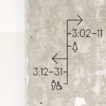
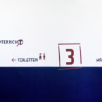
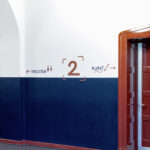
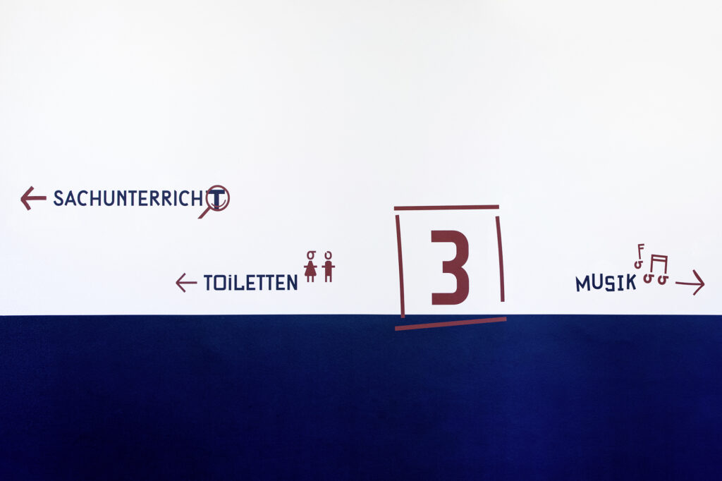
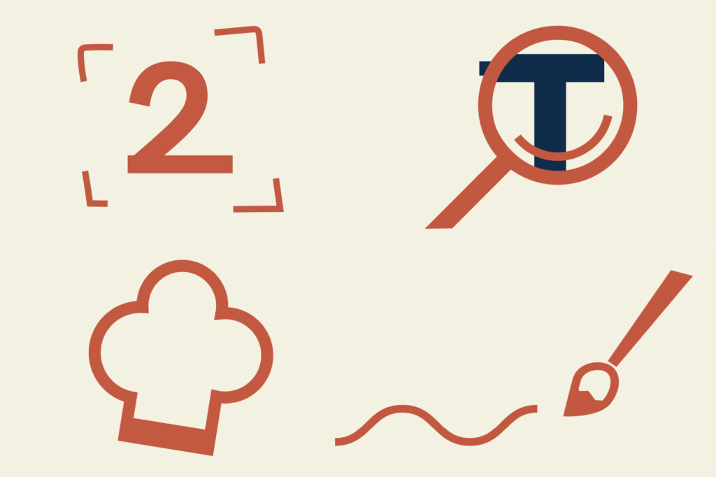
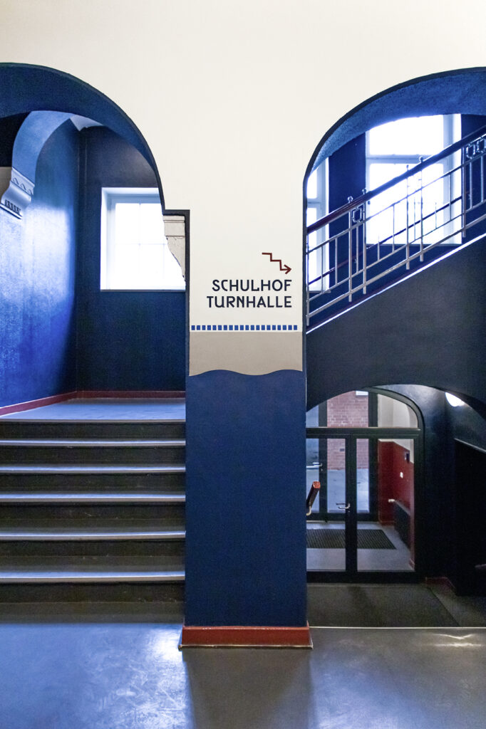
Designing for children who cannot yet read requires a unique approach to wayfinding. How did you determine which symbols and pictograms would be the most intuitive and universally understood by young students?
Nathanaël Gourdin: We also have extensive experience in this area. But we talk a lot with the teachers and also test directly with the children themselves. There’s nothing better. It’s always exciting to see how much they can abstract or sometimes not! Because children have a great imagination on the one hand and a very direct perception on the other.
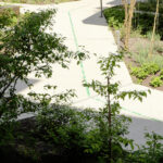
©Orientation system for the primary and pre-school Forsmannstraße in Hamburg by Studio Gourdin
©Orientation system for the primary and pre-school Forsmannstraße in Hamburg by Studio Gourdin
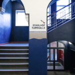
Beyond aiding navigation, the project also aims to create a sense of safety, trust, and motivation for children. What specific design elements did you incorporate to make the environment feel welcoming and reassuring for both students and educators?
Nathanaël Gourdin: This is clearly about identifying with the school as a building, but also with the school as an institution. It was therefore particularly important to choose a language that is familiar to children and teachers. Above all, the signage should support the feeling that the school is a place where you can experiment, a place with a lot of freedom, a place of movement. And that’s what the signage makes clear: it doesn’t look completely accurate, but spontaneous and cheerful. A nice accompaniment to everyday life…
©Orientation system for the primary and pre-school Forsmannstraße in Hamburg by Studio Gourdin
©Orientation system for the primary and pre-school Forsmannstraße in Hamburg by Studio Gourdin
Minimalism, architecture, and ordering systems play a key role in your design philosophy. How do you strike the right balance between clarity and creativity when developing signage, scenography, and corporate design solutions?
Nathanaël Gourdin: Clarity and creativity are not a contradiction in terms. When it comes to design, reduction is indeed a major challenge. However, we are never primarily interested in being minimalist. You can see this quite clearly in our project for the Forsmannstrasse school. The important thing for us is always the message: for whom and for what purpose are we designing? How minimalist the result is depends on that. Of course, I wouldn’t say that our language is baroque either!
©Orientation system for the primary and pre-school Forsmannstraße in Hamburg by Studio Gourdin
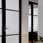
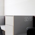
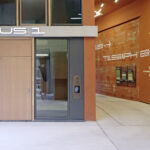
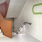
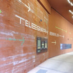
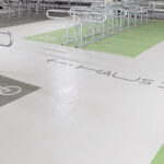
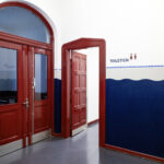
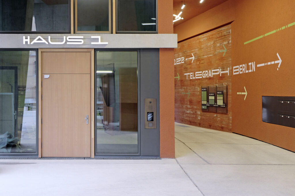
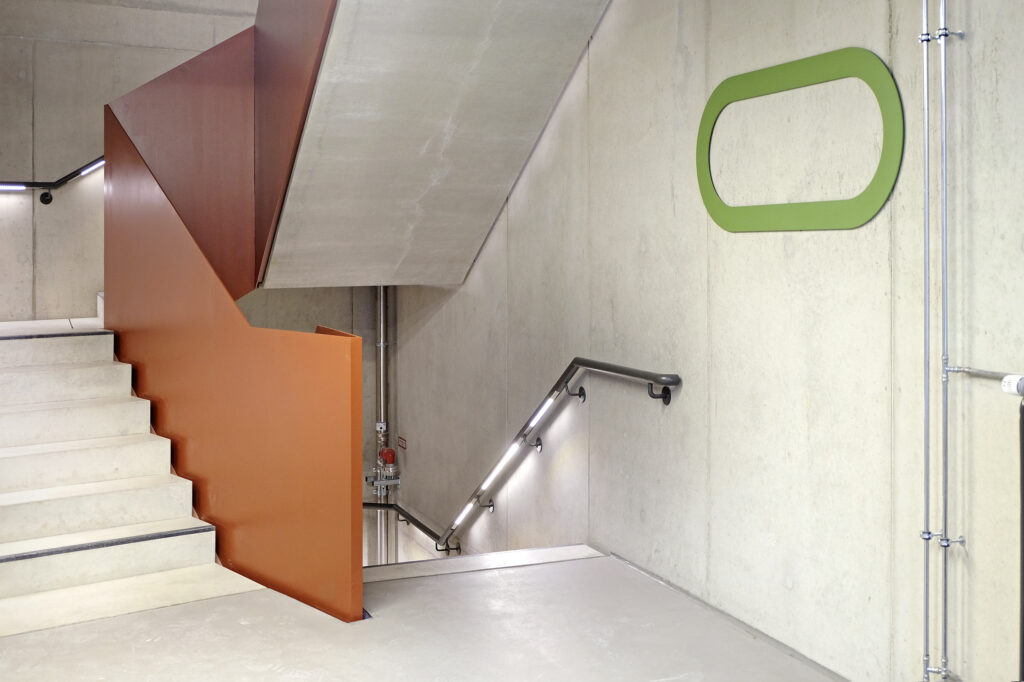
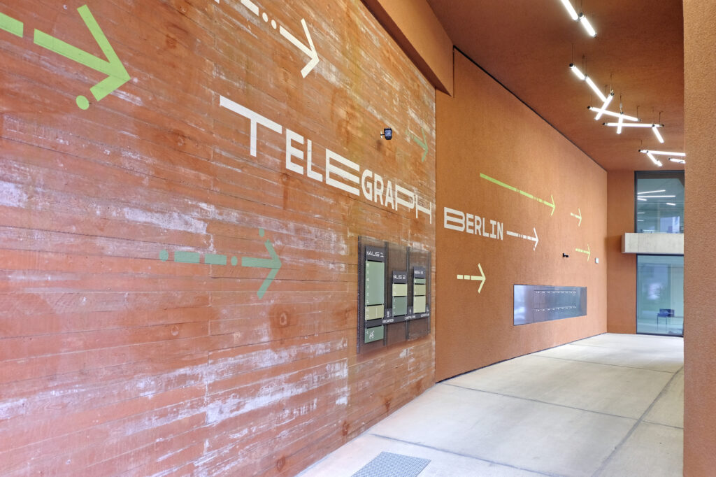
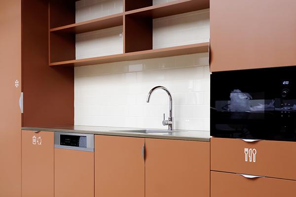
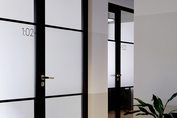
Your wayfinding system at Telegraph in Berlin goes beyond just signage—it contributes to the vibrancy of the workplace. How did you balance functionality with creating a stimulating and enjoyable environment for employees?
Nathanaël Gourdin: Basically, it works in a similar way to the school. The only difference is that the target groups are different and we are also transporting the history of the place into the present. This creates a certain tension and encourages dialogue. When we were photographing the signage, we were approached by a woman who works at the Telegraph. She found the signage very exciting, but didn’t know that telegraphs had been built there before. Then she understood the language and thought it was really great. It was a wonderful moment for us to see how design affects people. The impact of signage is particularly evident in everyday working life: it is a communication interface and is perceived. It can really influence people’s sense of well-being and motivation and connect them emotionally.
©Wayfinding system for Telegraph, Berlin by Studio Gourdin
©Wayfinding system for Telegraph, Berlin by Studio Gourdin
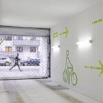
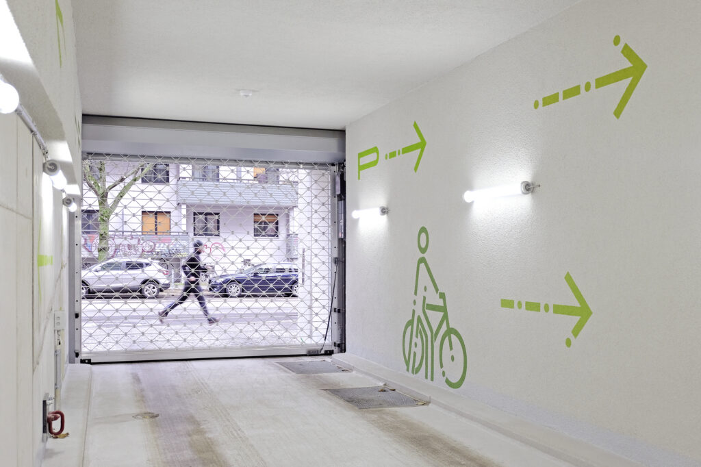
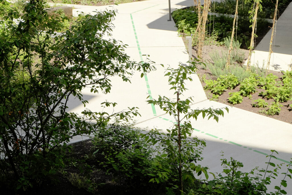
This project integrates sustainability, urbanity, and human-centered design. What were the biggest challenges in merging these aspects, and how did you ensure the wayfinding system aligns with Berlin’s growing emphasis on sustainable workspaces?
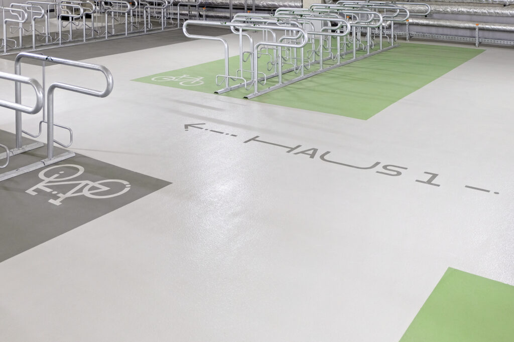
Nathanaël Gourdin: In fact, the project was not very challenging, as both our client and the architects were very open. We were therefore able to quickly develop and realise a shared vision. One special feature was the design of the underground car park with 250 parking spaces for bicycles and 10 for cars. It quickly became clear to us that if we wanted to encourage green mobility, the car park had to be inviting. We also signposted the nearest public transport at the exit of the campus. In this context, the signage was highly praised during the DGNB certification process.
©Wayfinding system for Telegraph, Berlin by Studio Gourdin
©Wayfinding system for Telegraph, Berlin by Studio Gourdin
With your background in language and interpretation, your work goes beyond visual aesthetics to focus on how people navigate and interact with spaces. How do you incorporate linguistic and cultural nuances into your design solutions for different environments?
Nathanaël Gourdin: Language is essential for dialogue between people. I always find it exciting to talk to foreign speakers myself, because you communicate differently than in your own language. Usually much more direct and with fewer filters. Sometimes that has advantages, sometimes it leads to small misunderstandings. But that’s also the exciting thing about intercultural dialogue! In case of signage we naturally look for solutions that are understandable for the vast majority of people. In addition, we always try to integrate foreign languages into our projects. For my first project – the German Hygiene Museum in Dresden – I suggested ‘Sorbian’ (a regional language with Slavic roots in eastern Germany) as a third foreign language, as otherwise we would have had to choose either Polish or Czech, even though both countries are roughly equidistant from Dresden. But unfortunately that was too unusual for the client…
©Wayfinding system for Telegraph, Berlin by Studio Gourdin
©Wayfinding system for Telegraph, Berlin by Studio Gourdin
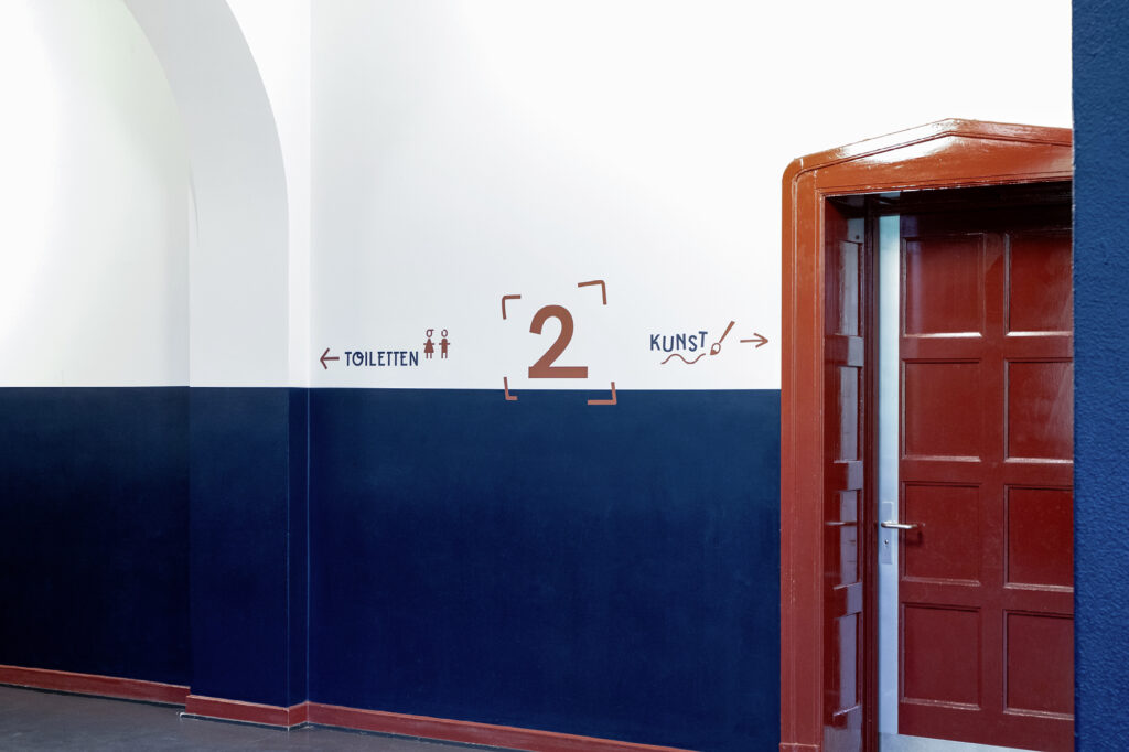
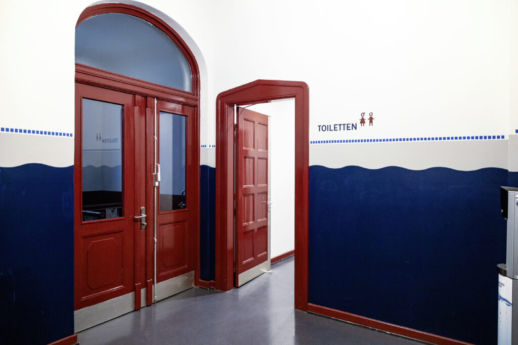
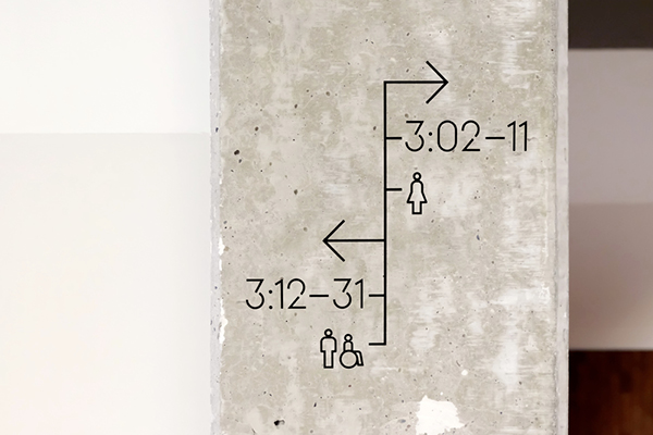
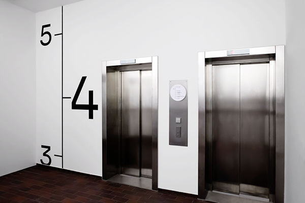
Your wayfinding design at Martinistraße 62–66 integrates minimalist aesthetics with industrial architecture. How did you strike the balance between functionality and visual harmony in this modern workspace?
Nathanaël Gourdin: Our system combines both. The client wanted the signage to have a strong connection to the city of Bremen with its long maritime tradition. We were therefore inspired by the freeboard marks of ships, which are graphically very memorable and also have a technical feel. This was a perfect match for the interior design of the new co-working space.
©Wayfinding system Martinistraße 62–66, Bremen by Studio Gourdin
©Wayfinding system Martinistraße 62–66, Bremen by Studio Gourdin
©Wayfinding system Martinistraße 62–66, Bremen by Studio Gourdin
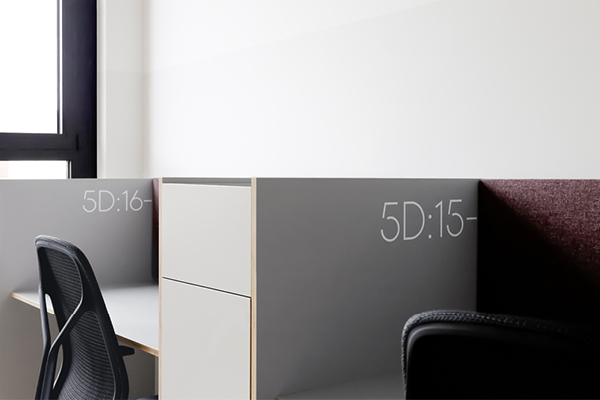
With Clockwise providing flexible workspaces, how does your wayfinding system adapt to the ever-changing dynamics of co-working environments where tenants and users frequently rotate?
Nathanaël Gourdin: In this co-working space, the room configuration does not change. There are different types of rooms for different uses. That was therefore not the issue.
©Wayfinding system Martinistraße 62–66, Bremen by Studio Gourdin
©Wayfinding system Martinistraße 62–66, Bremen by Studio Gourdin
Studio Gourdin thrives on tackling new challenges. Looking ahead, what kind of design challenges or innovations in spatial communication excite you the most, and how do you see your work evolving in the coming years?
Nathanaël Gourdin: What appeals to us are, on the one hand, complex locations but also the possibility of applying our design not only to the signage but also, for example, to the furniture (reception counters, cash desks, seating, etc.) in buildings with a lot of public traffic. After all, these are also important points of orientation. Among other things, we are currently working on outdoor furniture (park bench), which is a great project for me personally as a furniture designer. We would like to do this more often!